
Daniel, J. (2019, July 10). 6 Maps That Show How Bad Energy Poverty Is and Reveal 2 Ways to Make it Better. Retrieved from https://blog.ucsusa.org/joseph-daniel/6-maps-that-show-how-bad-energy-po...
Joseph Daniel, "Energy Poverty Maps", contributed by Morgan Sarao, The Energy Rights Project, Platform for Experimental Collaborative Ethnography, last modified 15 April 2020, accessed 26 July 2026. https://energyrights.info/content/energy-poverty-maps
Critical Commentary
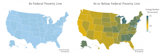
Maps showing the percent of household income spent on household energy bills for households with income four times higher than the federal poverty line (left) and households with income below the federal poverty line (right). Energy burdens are exacerbated for those already living in poverty, especially for households in the northeast.